Some Tips on Typography in Design
DesignHow to choose the right font width, font size, and font family for your design.
Choose the Right Font Family
If it is UI design, we should use the same font throughout the UI because it helps make the design more coordinated.
|
|
|---|
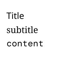
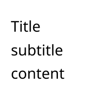
The left design uses different fonts, while the right design uses the same font.
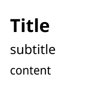
Choice of Font Weight and Size
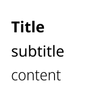
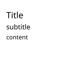
When we first look at a page, we see the title before the subtitle. This is because many pages always use different font weights and size to distinguish them.
|
|
|---|
The left design change the font width, while the right design change the font size.
If we change the font width and size at the same time, the design will be more refined. (Of course, pay attention to reasonable matching.)
Match with Appropriate Colors
We can also use different colors in the text to distinguish the title, subtitle, and content.
|

|
|---|
On the left, the text only has black color, but the right has different colors for the title, subtitle, and content.
At the Last
Width, size, font family, and color can all help make a typographic design more coordinated.